
Social Media Graphics Design, People scroll through social media fast. Research suggests the average person spends less than two seconds deciding whether to stop and engage with a piece of content or keep moving. In that window, words rarely do the work. Visuals do.
The graphic your brand posts is almost always the first thing someone notices. If it looks generic, low quality, or identical to what every other brand in your category is posting, it gets ignored. If it stands out visually, matches what the audience expects to see from a credible brand, and communicates something interesting within that two-second window, it earns attention.
Earning that attention consistently is what scroll-stopping social media graphics are built to do.
This guide covers everything your brand needs to know to design graphics that get noticed, represent your brand well, and drive real engagement across every platform.
What Actually Stops a Scroll
Before touching any design tool, it is worth understanding what human attention actually responds to in a social media feed. Scroll-stopping is not random. The same visual principles trigger attention consistently across audiences and platforms.
High contrast is the most reliable attention-grabber. When a graphic uses colors that sit at opposite ends of the spectrum from each other, the human eye picks it up faster than it processes low-contrast combinations. A bright graphic in a feed full of muted tones gets noticed not because it is louder but because it is different.
Faces and eyes draw attention at a biological level. Social media content that includes a human face, particularly one making direct eye contact with the camera, consistently outperforms content without faces in engagement metrics. According to Sprout Social’s research on social content performance, posts featuring real faces receive significantly higher engagement rates than those using product images or text alone.
Unexpected or unusual compositions break the visual pattern of a feed. Most social media graphics follow predictable layouts. A graphic that places its subject in an unexpected position, uses negative space differently from the norm, or applies an unusual crop creates a moment of visual surprise that causes the viewer to pause.
Text that is short enough to read instantly and interesting enough to want to read performs better than long text overlaid on images. If someone has to work to read your graphic, they will not. Three to five words in large, clear type outperforms a paragraph of smaller text every time.
Understanding these triggers means you can make deliberate design decisions rather than hoping your graphics happen to land well.
Lock In Your Brand Identity Before You Design Anything
One of the most common mistakes brands make on social media is posting graphics that look completely different from each other. One post uses warm tones and a serif font. The next uses cool blues and a sans-serif. Another has no consistent layout at all. The result is a feed that looks like it belongs to several different businesses rather than one recognisable brand.
Brand consistency in social media graphics is not about making every post look identical. It is about making every post feel unmistakably like yours. When someone scrolls past your content in a feed full of other posts, they should recognise it as yours before they consciously register your name or logo.
That recognition comes from three consistent elements. Your brand colors, your typography choices, and your overall visual style. Before you design a single social media graphic, document these three things specifically enough that anyone creating content for your brand can follow the same rules and produce graphics that feel cohesive.
Your brand colors should be a defined set of hex codes rather than general descriptions. “Blue” is not a brand color. “Royal blue at hex code 2C5F8A, paired with warm white at F9F7F3 and used alongside accent gold at D4AF37” is a brand color system that produces consistent results.
Your typography should be limited to two fonts at most. One for headlines and one for body text or supporting information. Fonts communicate personality as clearly as colors do. A brand using a clean geometric sans-serif communicates something different from one using an elegant serif, and both communicate something different from a brand using a rounded, friendly typeface. Choose deliberately and apply consistently.
Choose Colors That Work Specifically for Social Media
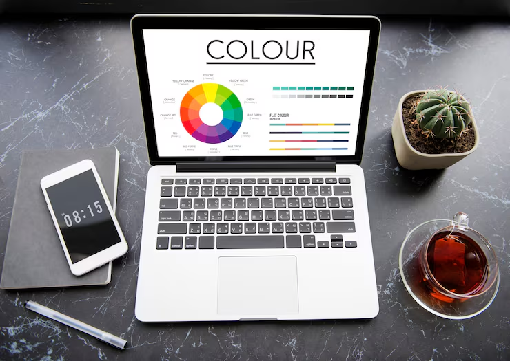
Brand colors chosen for print or web design sometimes behave differently on social media. Screens vary, platform compression affects image quality, and the surrounding context of a social media feed changes how individual colors read.
Test your brand colors specifically within the platforms you use. Create a simple test graphic using your brand palette and view it on your phone’s Instagram or Facebook feed rather than on a design tool on your computer. Colors that look striking on a large monitor sometimes look muddy or washed out on a phone screen. Colors that seem safe on a white design background sometimes disappear when surrounded by the platform’s own interface colors.
High contrast combinations between background and foreground elements are more critical on social media than in other design contexts. The goal is immediate readability at a glance, which requires the text and key visual elements to stand out clearly from whatever is behind them.
Color psychology also plays a role in how audiences respond to your graphics. According to HubSpot’s research on visual marketing, color increases brand recognition by up to 80 percent. Audiences form unconscious associations between colors and brand personality within seconds. Using your brand colors consistently across every piece of social media content accelerates that recognition building with every impression your graphics earn.
Pick Fonts That Read Clearly at Small Sizes
Most social media graphics are viewed on a phone screen. At the scale of a phone display, font choices that look elegant at large sizes on a desktop become difficult to read when compressed into a small card.
The fonts that perform best on social media graphics share a few characteristics. They have clear differentiation between individual letters so nothing blurs together at small sizes. They have consistent stroke weights that hold up under platform image compression. And they have enough personality to reflect your brand while remaining readable at a glance.
Avoid highly decorative script fonts for any text that carries essential information. These can look striking on a design tool and become illegible when the graphic is viewed at actual social media size. Reserve decorative typography for a single design accent element and use a clean, readable font for everything the viewer actually needs to read.
Limit the number of fonts in a single graphic to two. One headline font and one supporting text font is almost always enough. Using three or more fonts in a single post creates visual noise rather than variety and makes the graphic look unfinished rather than designed.
Test every graphic at actual viewing size before publishing. Zoom your browser to 100 percent, or better yet, send the graphic to your phone and view it in the platform it will actually appear on. If you cannot read the text comfortably within two seconds, the font is too small or the contrast is insufficient.
Use the Right Image Dimensions for Every Platform
Every social media platform has specific image dimension requirements, and posting graphics at the wrong size produces cropped, distorted, or pixelated results that immediately undermine the quality impression your brand needs to make.
Instagram feed posts perform best as square images at 1080 by 1080 pixels. Instagram Stories and Reels use a vertical 1080 by 1920 pixel format. Instagram also allows portrait images at 1080 by 1350 pixels in the feed, which take up more vertical space than square images and typically drive higher engagement because they occupy more of the viewer’s screen.
Facebook feed posts display best at 1200 by 630 pixels for landscape orientation or 1080 by 1080 pixels for square. Facebook Stories match Instagram Stories at 1080 by 1920 pixels. LinkedIn posts display at 1200 by 627 pixels for link previews and 1080 by 1080 pixels for square image posts.
TikTok and Pinterest have their own specific requirements that differ from the above. Always check the current recommended dimensions for each platform you use, as these change periodically.
Designing at the correct dimensions from the start saves significant time and prevents the quality loss that comes from resizing graphics after they have been created. Most design tools allow you to set canvas size before you begin working, which makes this easy to get right every time.
Build Every Graphic With a Clear Visual Hierarchy
Visual hierarchy is the arrangement of design elements in a way that guides the viewer’s eye in the order you want them to see things. In a social media graphic, you typically want the most important information to register first, supporting information second, and your brand identity third.
This does not mean the most important element has to be the largest or the most colorful. It means the design should make it obvious where to look first. High contrast, size difference, and placement all contribute to directing attention within a layout.
A common effective structure for social media graphics places the primary message or image in the dominant visual position, a supporting line of text below or alongside it that adds context or specificity, and the brand logo or name in a consistent location across all your graphics, typically a corner. This structure works because it respects the order in which a viewer needs information: what is this about, what does it mean for me, and who is saying it.
White space, which is empty space with no design elements in it, is one of the most powerful tools for creating visual hierarchy. Designs that are too dense with text and images force the viewer to work to find the main point. Designs that use space deliberately let the most important elements breathe and register faster.
Canva’s design learning resources cover visual hierarchy in accessible, practical detail and are useful for anyone building social media graphics without a formal design background.
Use Photography That Feels Genuine
Stock photography has a reputation problem that is largely deserved. The kinds of stock images that have been used millions of times across millions of websites and social media posts, the perfectly lit office handshake, the diverse team looking at a laptop, the woman laughing alone at salad, have become so familiar that audiences filter them out instantly.
When your brand uses photography on social media, genuine images outperform generic stock images in almost every metric. Real photos of your products, your team, your work, your customers, and your physical environment consistently generate more engagement than polished but impersonal stock imagery because they communicate authenticity.
If you do use stock photography, choose images that look less like stock. Natural light photography, imperfect compositions, candid moments, and images that avoid the overly staged look of traditional stock feel more credible. Platforms like Unsplash and Pexels offer free photography libraries where the images tend toward a more natural aesthetic than traditional stock libraries.
For your own photography, consistency in lighting and editing style matters as much as image quality. Photos taken in consistent lighting conditions with consistent editing applied in post-processing create a cohesive visual aesthetic for your brand even when the subjects and compositions vary widely.
The Mark X Media project portfolio shows examples of how strong visual content works across different brand types and industries, which can be a useful reference when deciding on the visual direction for your own social media graphics.
Build Templates That Keep Your Content Consistent and Fast
Creating social media graphics from scratch for every post is time-consuming and almost always produces inconsistent results. Templates solve both problems simultaneously.
A social media template is a pre-built design layout with your brand colors, fonts, and structural elements already in place. When you need to create a new post, you open the template, swap in the new image or text, and publish. The result looks designed and on-brand because the design work was done once and the template carries it forward.
Create templates for each type of content your brand publishes regularly. A quote template. A product feature template. A tips or educational content template. A promotional offer template. An announcement template. Each serves a different content purpose while maintaining visual consistency across your feed.
Canva, Adobe Express, and similar tools allow you to save brand kits with your exact colors, fonts, and logo, which makes template creation straightforward even without professional design skills. Build your templates once, share them with anyone who creates content for your brand, and the baseline quality and consistency of your social media graphics will improve immediately.
Buffer’s research on social media content strategy confirms that brands posting consistently designed content across their social channels see stronger audience growth and higher engagement rates than those with inconsistent visual presentation, even when the content quality and posting frequency are otherwise similar.
Write Text on Graphics That Gets Read in Two Seconds
When you add text to a social media graphic, that text needs to be short enough to absorb instantly and interesting enough to make the viewer want to engage further. Social media is not the place for long explanations or nuanced arguments. It is the place for a clear, striking statement that earns the click, the save, or the share.
Keep headline text on graphics to seven words or fewer wherever possible. The image or graphic carries visual weight. The text should add a specific idea, question, or statement that makes the image more meaningful, not explain everything the viewer needs to know. Reserve detailed information for the caption below the image.
Use your text to start a conversation rather than conclude one. A graphic that asks a question, makes a bold statement, or presents a surprising fact consistently generates more engagement than one that simply announces information. Comments, shares, and saves all signal to the platform that your content is worth showing to more people, which extends reach without any increase in advertising spend.
Design for Mobile Viewing First
The majority of social media is consumed on phones, which means every graphic you create should be designed for and tested on a phone screen before it is considered finished.
Mobile viewing changes several design considerations. Elements that appear well-spaced on a desktop design can feel cramped at mobile scale. Text that is readable on a 27-inch monitor at a comfortable distance becomes difficult to read on a 6-inch phone screen held at arm’s length. Fine details in photography that are visible on desktop become invisible at mobile size.
Get into the habit of previewing every graphic on your actual phone before posting. Send the file to your phone and view it in the platform it will appear on. If anything feels hard to read, visually crowded, or unclear at mobile size, adjust the design before publishing.
For platforms like Instagram Stories and TikTok that are consumed exclusively in vertical format on mobile, design specifically for the vertical frame from the start rather than adapting a horizontal or square design to fit. Vertical-native content always feels more intentional and performs better than content that was clearly designed for a different format.
Know When to Use Video and Animation Instead of Static Graphics
Static graphics are fast to produce and reliable across all platforms, but video and animation consistently outperform static images in reach and engagement on most social media platforms. The algorithm on Instagram, Facebook, TikTok, and LinkedIn all give preferential distribution to video content, which means a brand that incorporates video alongside static graphics reaches more people with less advertising spend.
Simple animations are more accessible than most brands assume. Adding a subtle movement to an otherwise static graphic, such as animated text appearing on screen, a slow zoom on a background image, or a short loop of a graphic element, creates video content without requiring filming or complex production. Canva and Adobe Express both include animation tools that apply these effects to static designs in minutes.
Even low-production video content shot on a phone, such as a 15-second product demonstration, a brief team introduction, or a behind-the-scenes process clip, consistently outperforms most static graphics in organic reach when it feels authentic and clear rather than polished but artificial.
The relationship between strong visual content and broader digital marketing strategy, including how social media graphics support performance advertising campaigns and contribute to overall brand visibility, is covered through Mark X Media’s full services. When social media content and paid advertising are built from the same visual direction, both perform better.
If you want your social graphics to drive traffic that converts, the quality of the landing pages and overall digital presence those graphics send people to matters as much as the graphics themselves. Mark X Media’s SEO optimization services build the organic foundation that social media content needs to support and be supported by in a full digital strategy.
Test What Works and Build on It
The most effective social media graphic strategy is not built in one sitting. It is built through consistent publishing and consistent attention to what the data shows about what your specific audience responds to.
Track engagement metrics for every type of graphic you publish. Compare the performance of graphics with faces against those without. Compare high-contrast designs against softer ones. Compare quotes against product images against educational content formats. Over time, patterns emerge that tell you what your audience specifically stops to engage with, not what works for social media in general.
Use those patterns to refine your templates and your content mix. If a particular graphic format consistently drives saves and shares, build more content in that format. If another format that you expected to perform well consistently underperforms, retire it regardless of how much you like the design.
Making Your Brand Unmissable in a Crowded Feed
Social media feeds are crowded and getting more crowded. The brands that earn consistent attention in that environment are not necessarily the ones with the biggest budgets or the most professional design teams. They are the ones that understand what stops a scroll, have a clear and consistent visual identity, and publish content that their specific audience finds genuinely worth engaging with.
Build your brand identity clearly. Create templates that make consistency easy. Design for the mobile viewer. Test what works and do more of it. Apply those principles consistently across every graphic your brand publishes and your social media presence will stand out where it counts.